
The latest range of iPhones make use of a full-screen design with the infamous notch at the top to house the camera, speaker unit and sensors.
Whilst the latest iOS generally incorporates the notch seamlessly into the interface design there is one particular case that I noticed and wished to improve upon.
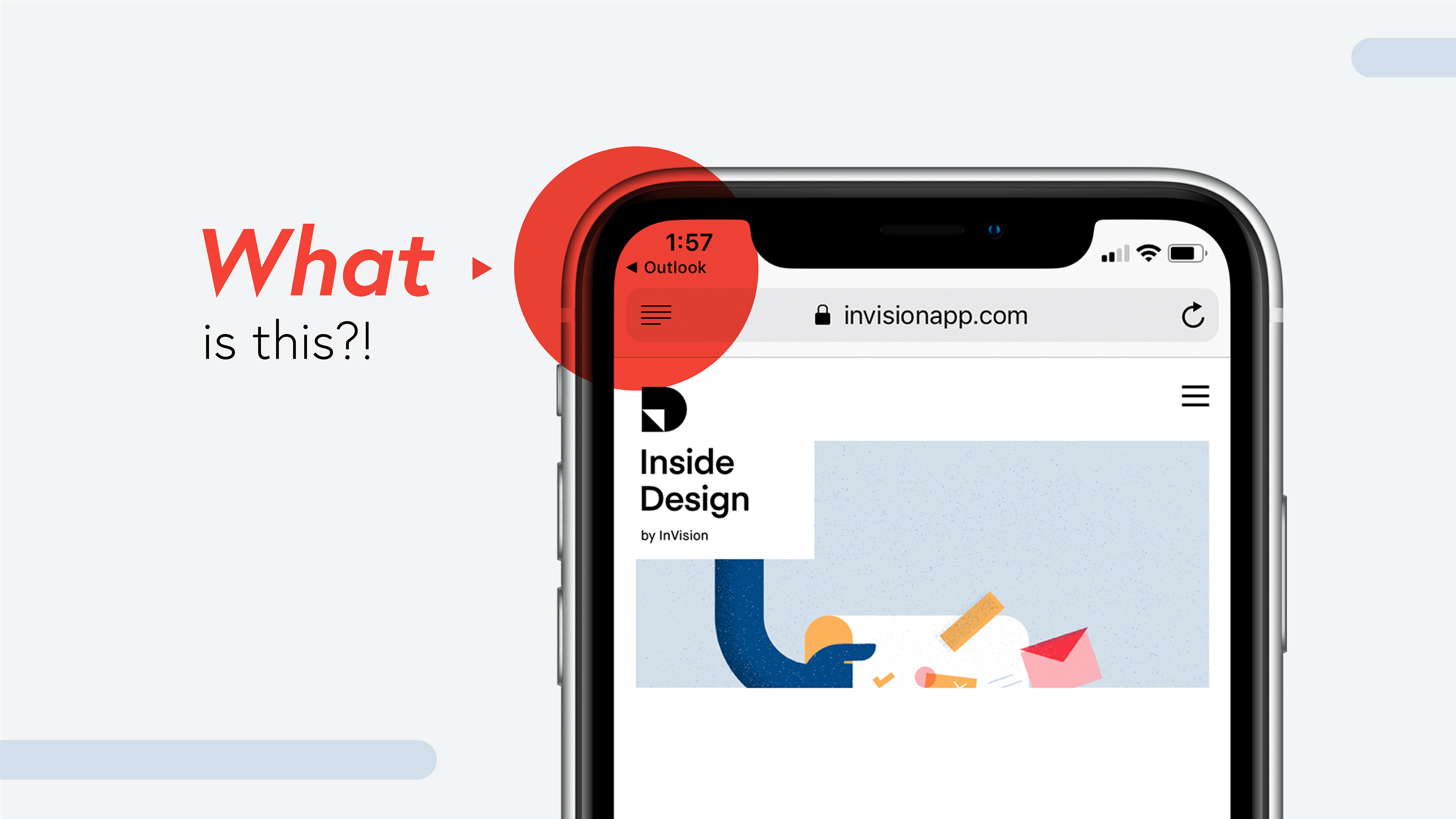
In iOS 12, after clicking a link that causes you to leave an application and enter a new application, a little arrow and title pop up in the top left corner under the clock which allows you to jump straight back to the original app.
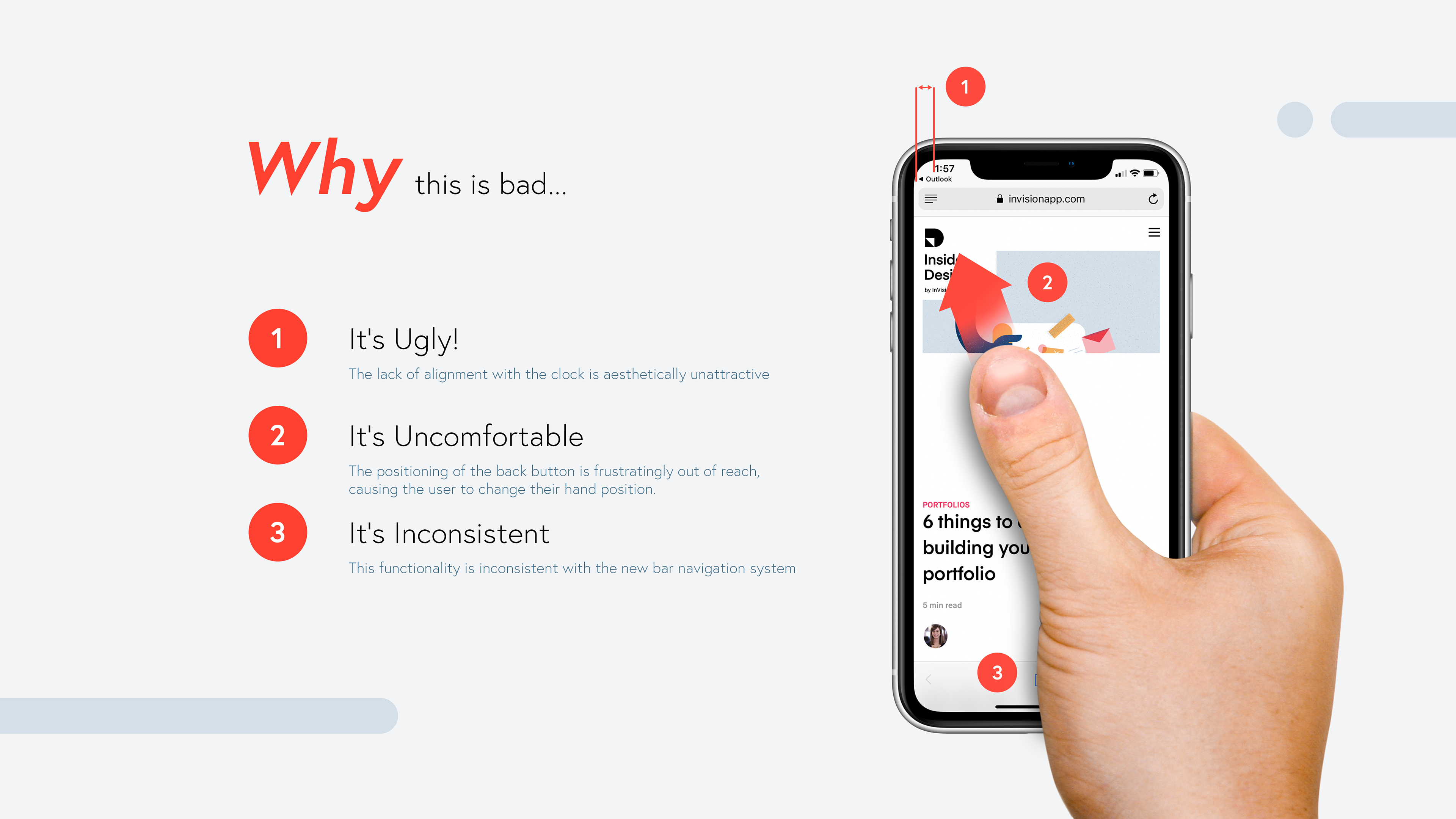
Whilst this provides a useful reminder that you have just left the original app and gives you a quick option to return, there are a number of problems highlighted above that cause the navigation button to be ineffective.
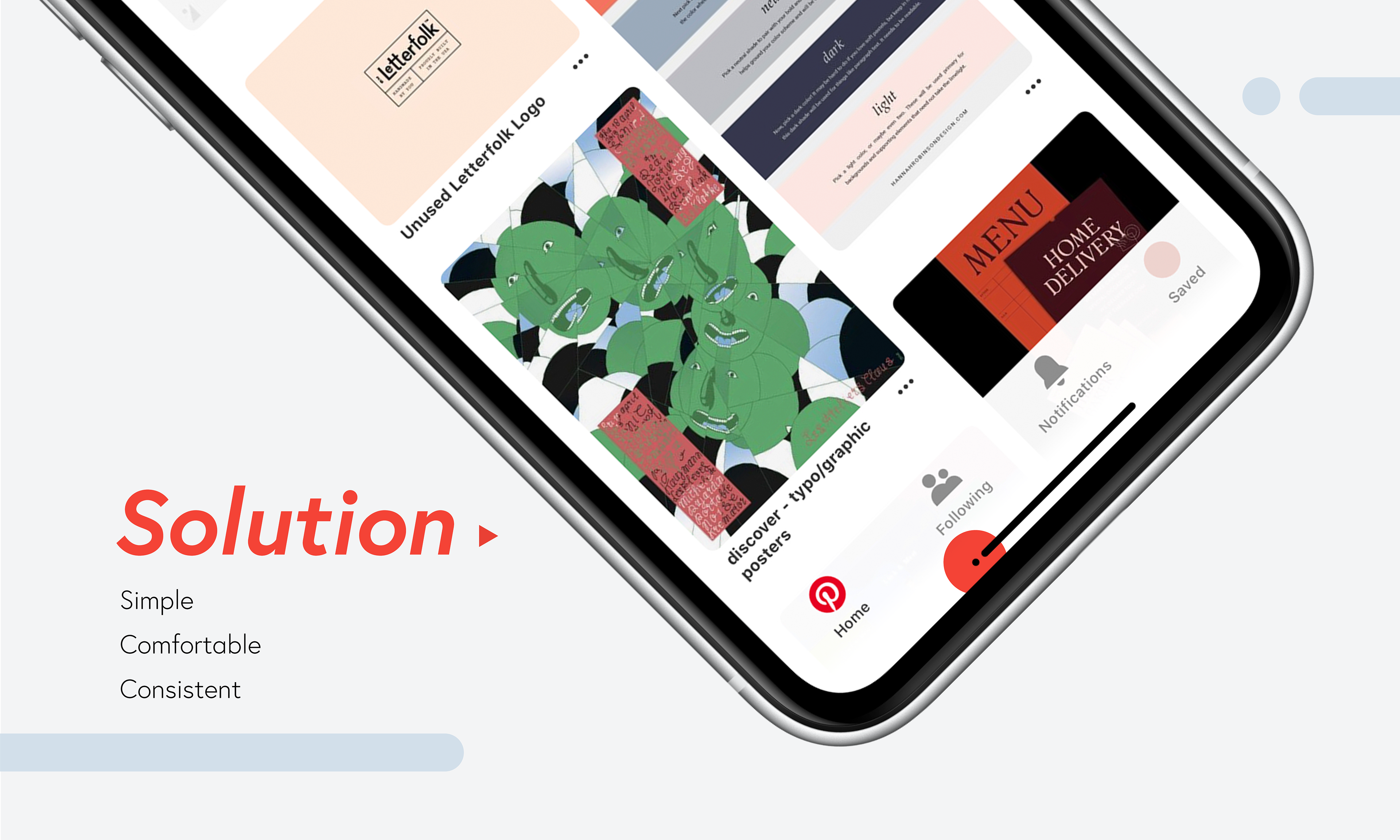
A quick prototype above was created to see how people interacted with the proposed design.
Furthermore, a final prototype was created and visualised in a scenario where the navigation would be used. This was mocked up using Invision Studio making full use of its motion animation tools.